React Native is a JavaScript framework for building mobile application. This Open-Source framework was first released in 2015 by Facebook. Its main usage is of developing web applications for various platforms like Android, iOS, UWP and Web.
Flexbox in React Native
Flexbox serves the function of providing consistent layouts on varied screen sizes. It works in the same manner in React Native like the way it does in CSS for the web. However, it has some differences.
Flex
It will direct how our flex items will fill over the available space in relation to the Axis. It would direct component to change its dimensions to fill the space of the container it is in. Flex property will be kept in mind while dividing and allocating the space.
Flex Container
There is a concept of relation in Flex layout. There is a parent element which contains the child elements nestled in it. This parent element is called Flex container.
Flex items
The children elements which are nestled in the main container are called the Flex items.
By Default
Flex container arranges all children elements in a horizontal manner by default. The reason for this is CSS flex-direction property which has the initial value ‘row’. This property follows the direction of the Main Axis in the container. As a result, the children elements follow the parent container’s direction. Hence, the change in direction would apply to the Main Axis and in turn, to the parent and the child elements.
Example:
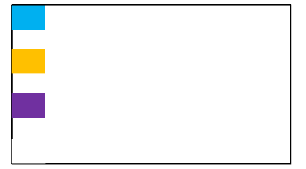
Let’s look at an example. We have four children elements which are differentiated using different colors. Below are the proportions in which they are arranged:
▪ Light Blue view uses flex:1.
▪ Orange view uses flex:2.
▪ Purple view uses flex:3.
▪ Grey (white,Background1,darker50%) view uses flex:4.

As it can be seen that light blue, orange, purple and grey gets1/10, 2/10, 3/10 and 4/10 of the space respectively.
Flex Direction
It will decide the direction in which the children elements will be laid out. There are two axis which we have to know:
▪ Main Axis (Flex Direction)
▪ Cross Axis (perpendicular axis to the main axis)

The ways in which the arrangement can take place, are descried below:
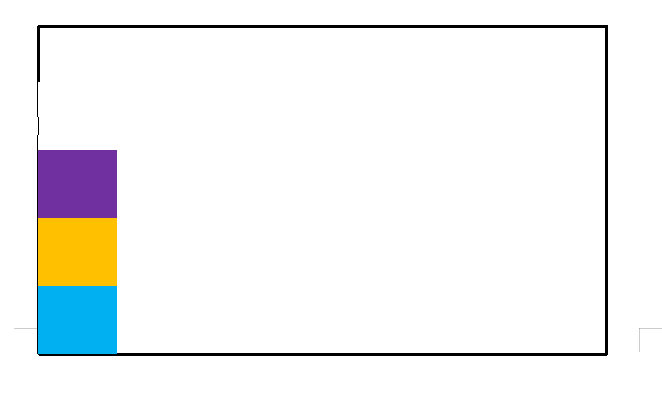
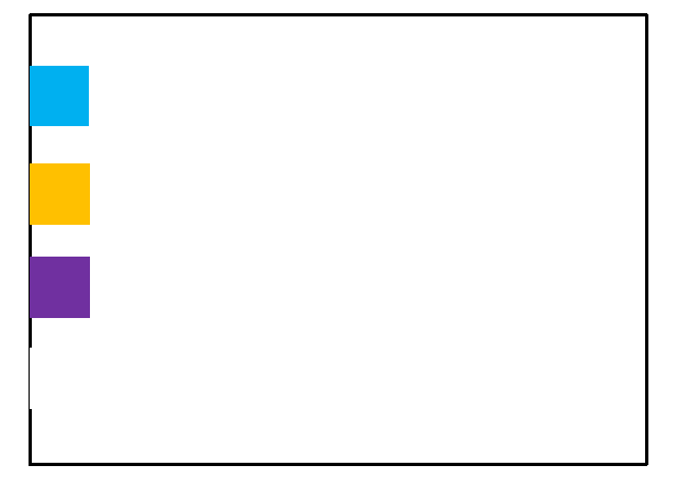
Row
When children elements are arranged from left, it is called the ‘Row’ arrangement. It goes from left to right as shown in Figure 4.

Similar types of results can be obtained from various arrangements.
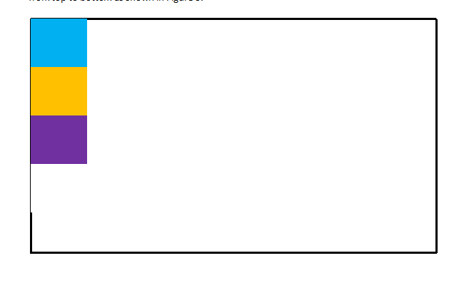
Column
When the children elements are arranged from top, it is called the ‘Column’ arrangement. It goes from top to bottom as shown in Figure 5.
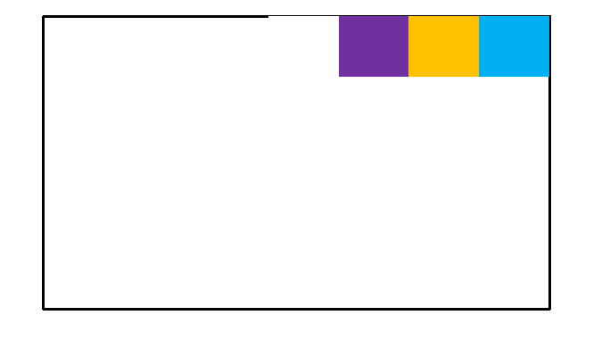
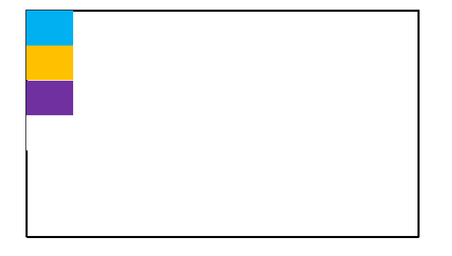
Row-Reverse
When children elements are arranged from right, it is called the ‘Row-Reverse’ arrangement. It goes from right to left as shown in Figure 6.
Column-Reverse
When children elements are arranged from bottom, it is called the ‘Column-Reverse’ arrangement. It goes from bottom to top as shown in Figure 7.
Justify Content
Justify Content determines how the children would align along the Main Axis. Below are ways in which this can be done:
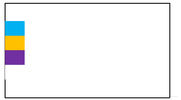
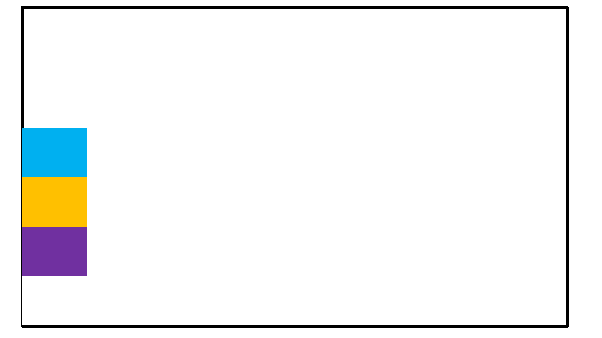
Flex-Start
Children elements are aligned to the start of the Main Axis of a container as shown in Figure 8.
Center
Children elements are aligned to the center of the Main Axis of a container as shown in Figure 9.
Flex-End
Children elements are aligned to the end of the Main Axis of a container as shown in Figure 10.
Space-Between
Children elements are evenly spaced across the container's Main Axis. It would distribute the leftover space between the children elements as shown in figure 11.
Space-Around
Children elements are evenly spaced across the container's Main Axis. It would distribute the leftover space between the children elements. However, there is a major difference between Space-Between and Space-Around. In Space-Around there is space distributed before the beginning of the first child and after the end of the last child as shown in figure 12.
Align Items
This function directs how children should be aligned along the Cross Axis of their container. The major difference between Align items and Justify Content is in the latter alignment is along the Main Axis whereas in the former it is along the Cross Axis.
Below are the different ways in which the items can be aligned:
Flex-Start
Children elements are aligned to the start of the Cross Axis of a container.
Center
Children elements are aligned to the center of the Cross Axis of a container.
Flex-End
Children elements are aligned to the end of the Cross Axis of a container.
Stretch
It would be the default value. Children elements are stretched to match the height of the Cross Axis of a container
Baseline
Children elements are aligned along a common baseline.
Align Self
When we want to apply the impact to single child instead of all the children within a container, you can apply alignself to it to change its alignment within its container. It has the same options and effects as Align Items.
Align Content
There are options of aligning the content which would describe the distribution of lines along the Cross Axis. However, it would only have effect when items are wrapped to more than one lines using flexWrap. The options are similar to what we had in Align Items.
▪ Flex-Start
▪ Center
▪ Flex-End
▪ Stretch
▪ Space-Between
▪ Space-Around
Thus, there are various possibilities of alignments using Flex in React Native. Hire skilled android and ios app development company to understand react native technology for mobile app.